Overview
Problem
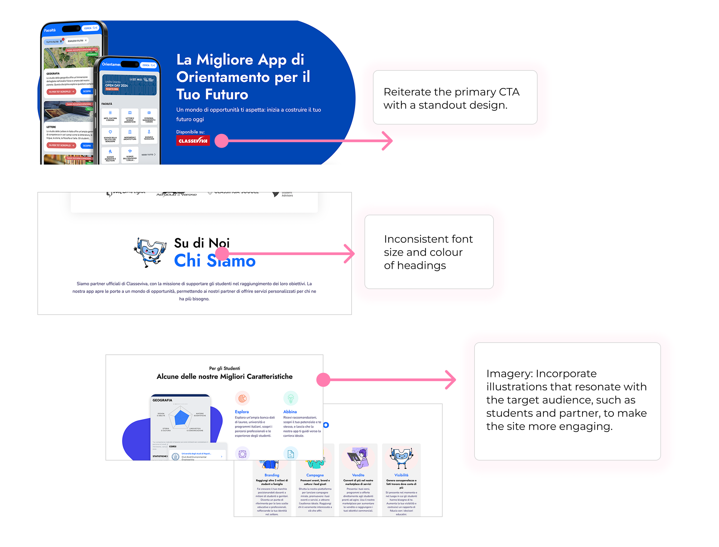
The overall visual style is inconsistent, there is a lack of visual guides and visualisations, and some of the website and app pages do not guide users to take full advantage of the power of the UniOrienta platform.
UniOrienta‘s mission is to remove barriers between students and higher education by helping them find the right university for them AND to help universities recruit more stu- dents and better students for their programs. Unichats is an AI-powered chatbot which univer- sities can install on their website
1.Deliver adhoc designs (banners, ppts, illustrations).
2. mapping the user experience and segments of the UniOrienta App.
3. Research and benchmark other apps, websites similar to Uniorienta
UniOrienta
Graphic Design and User Experience Research
Role: Graphic Designer, illustrator
Tools: Figma, Miro, Procreate
Your go-to partner for a new world of opportunities
Audience
Italian students
Academic & Corporate Partners
Part one : Improve the visual of the APP & Web
Visual issues of the APP
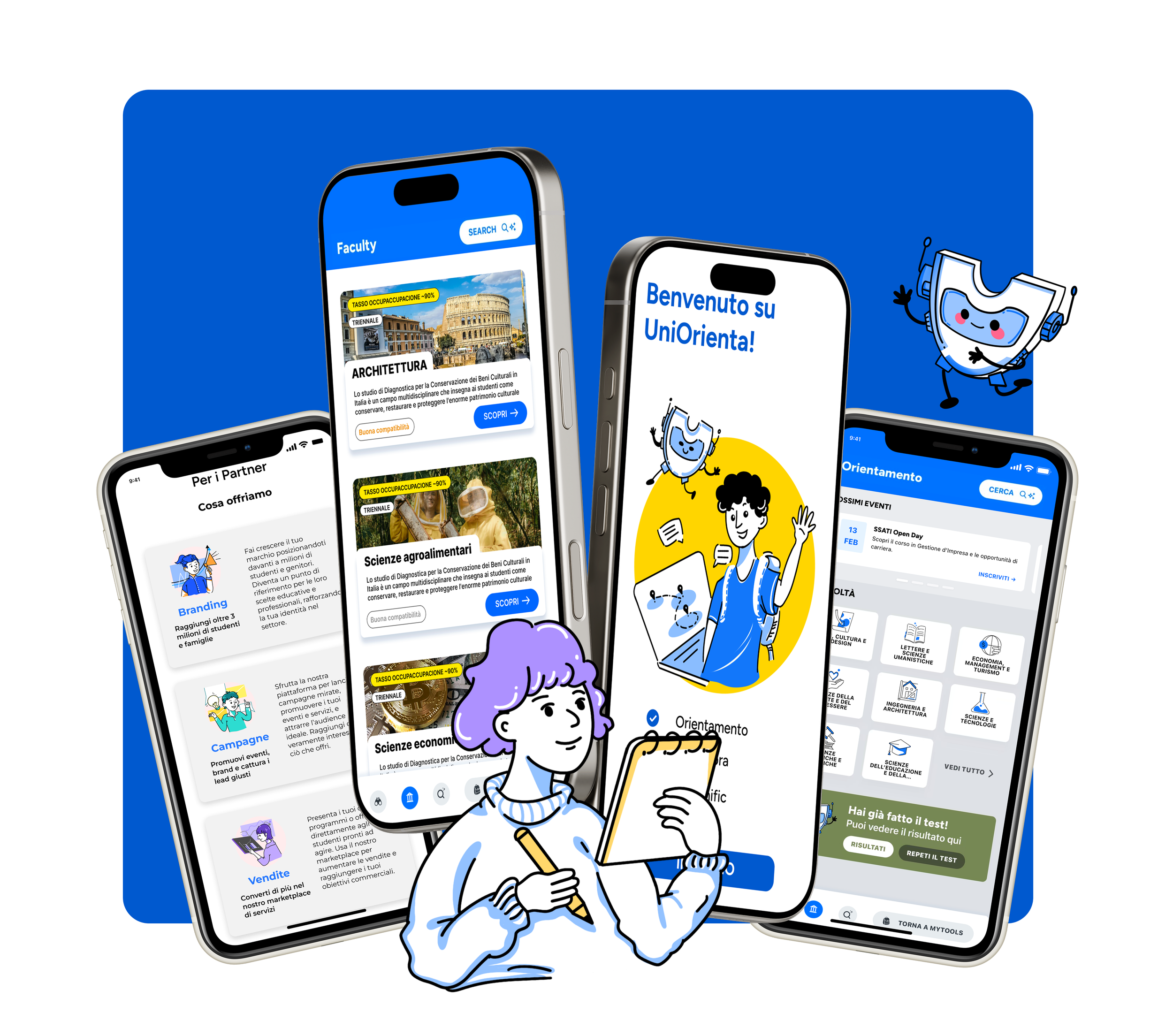
Iteration: Proposal of the APP
Colour scheme
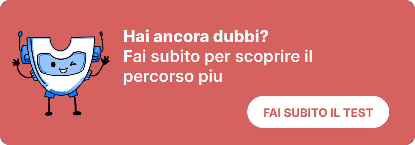
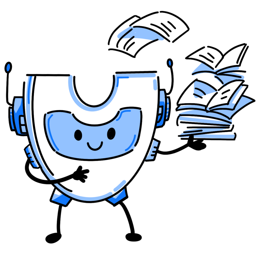
IP Design
-
Morphological features are an important visual means of communicating IP core values and brand messages
-
The image of an AI robot based on the letter U of the brand, wearing a customer service headset, represents UniOriente's use of AI to help students plan their study abroad applications, rounded shape lines make it feel friendly and close to people.
Visual issues of the APP 2
Visual issues of the APP
Solution
My work is divided into two parts
The solution included improve visualisation, stylistic unification, user experience improvements and rearranging components to create a visual hierarchy to create a more user-friendly experience.
First I established the overall visual style, improving on the original colour scheme
Iteration: Determination of style
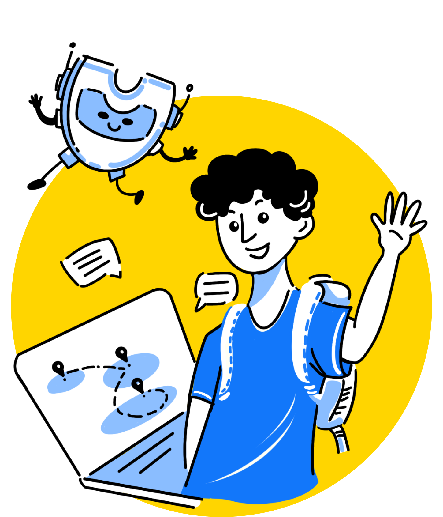
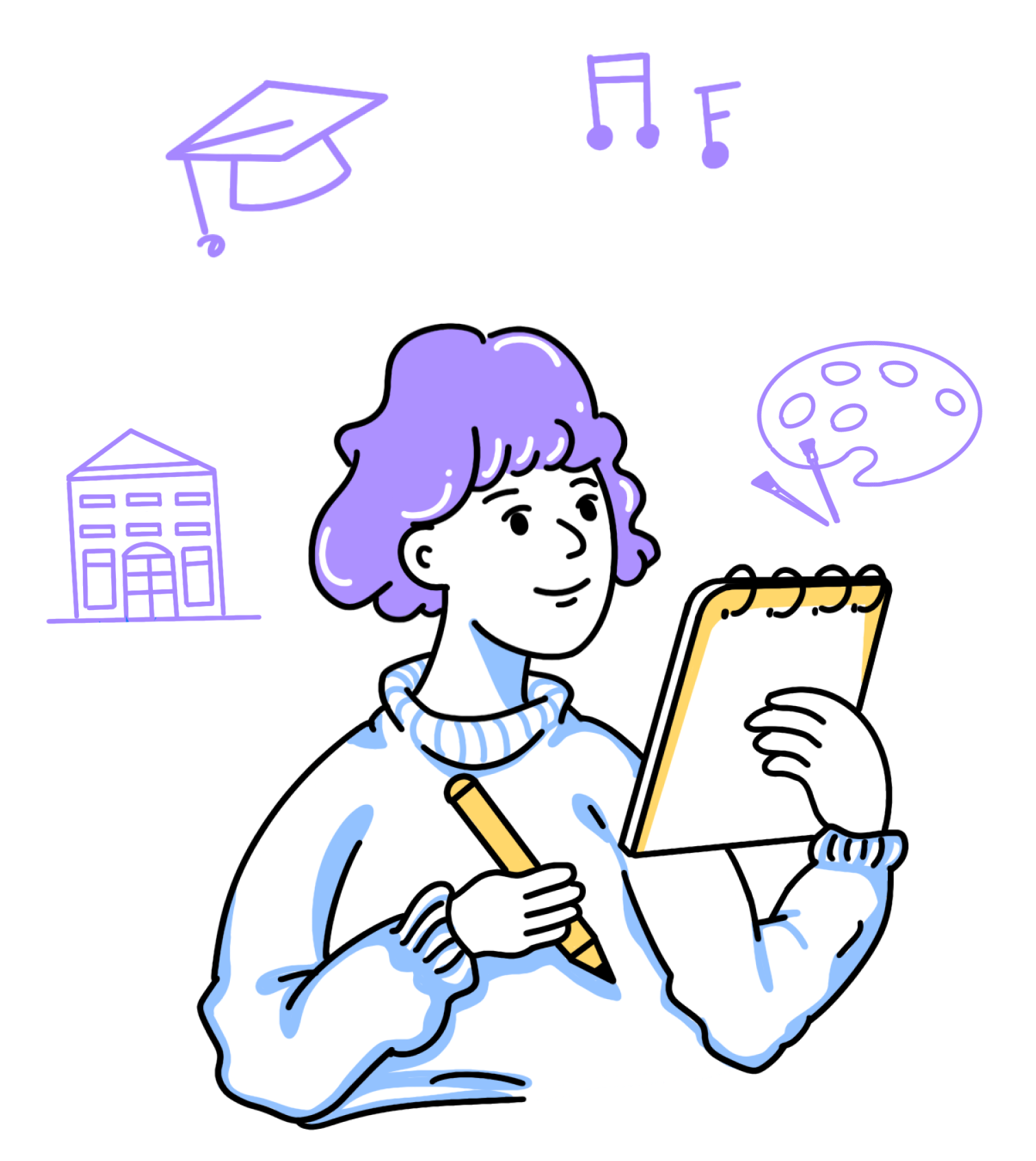
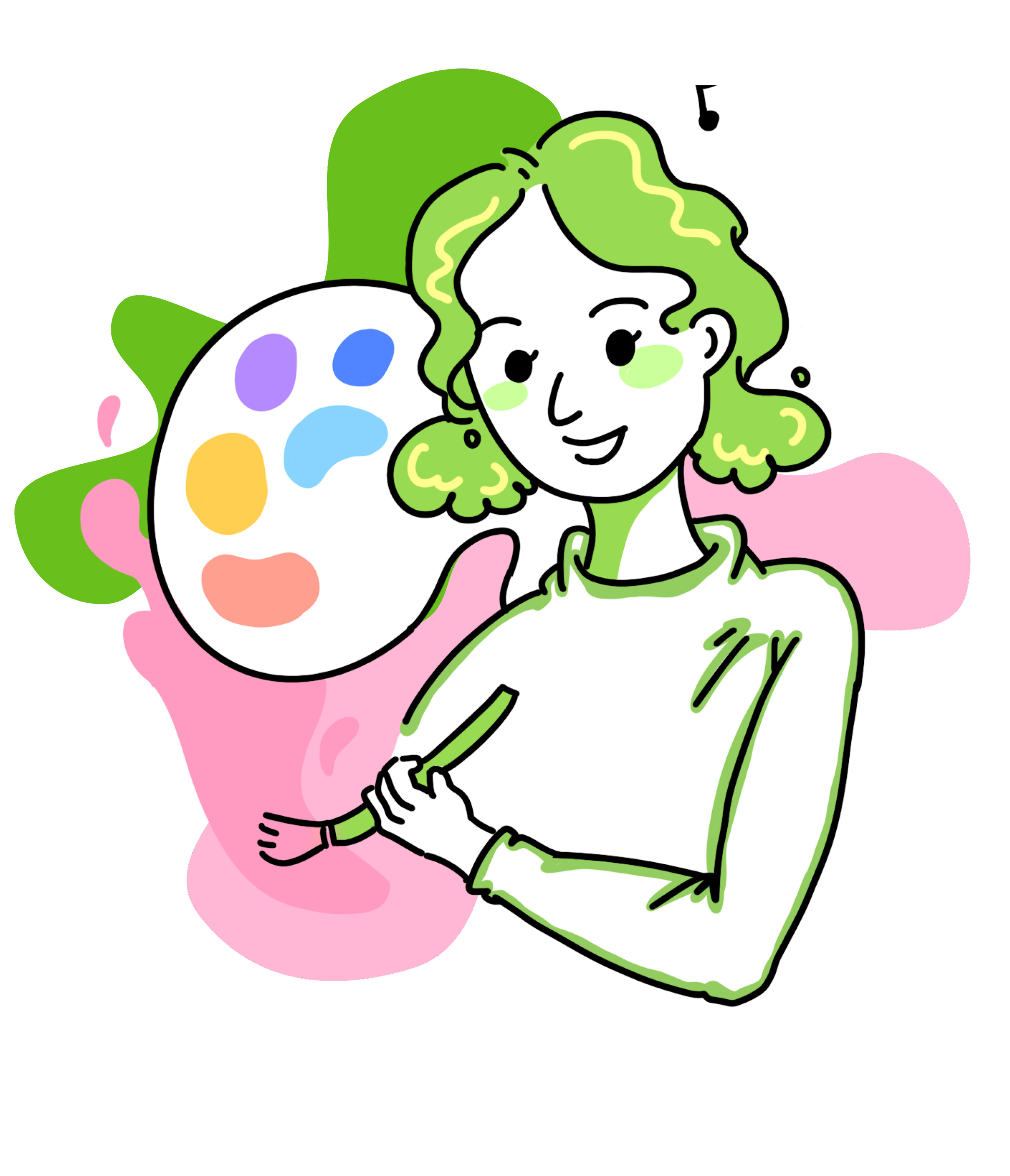
I chose to use simple lines and colour blocks, using the movement of the characters to highlight the content of the expression and positive emotional resonance, and adding warm colours to the original colours to enhance the contrast.
The version when the user has not answered the test yet
Visual issues of the web
On mobile
Iteration: Proposal of the web
On laptop
Banner
The version after the test
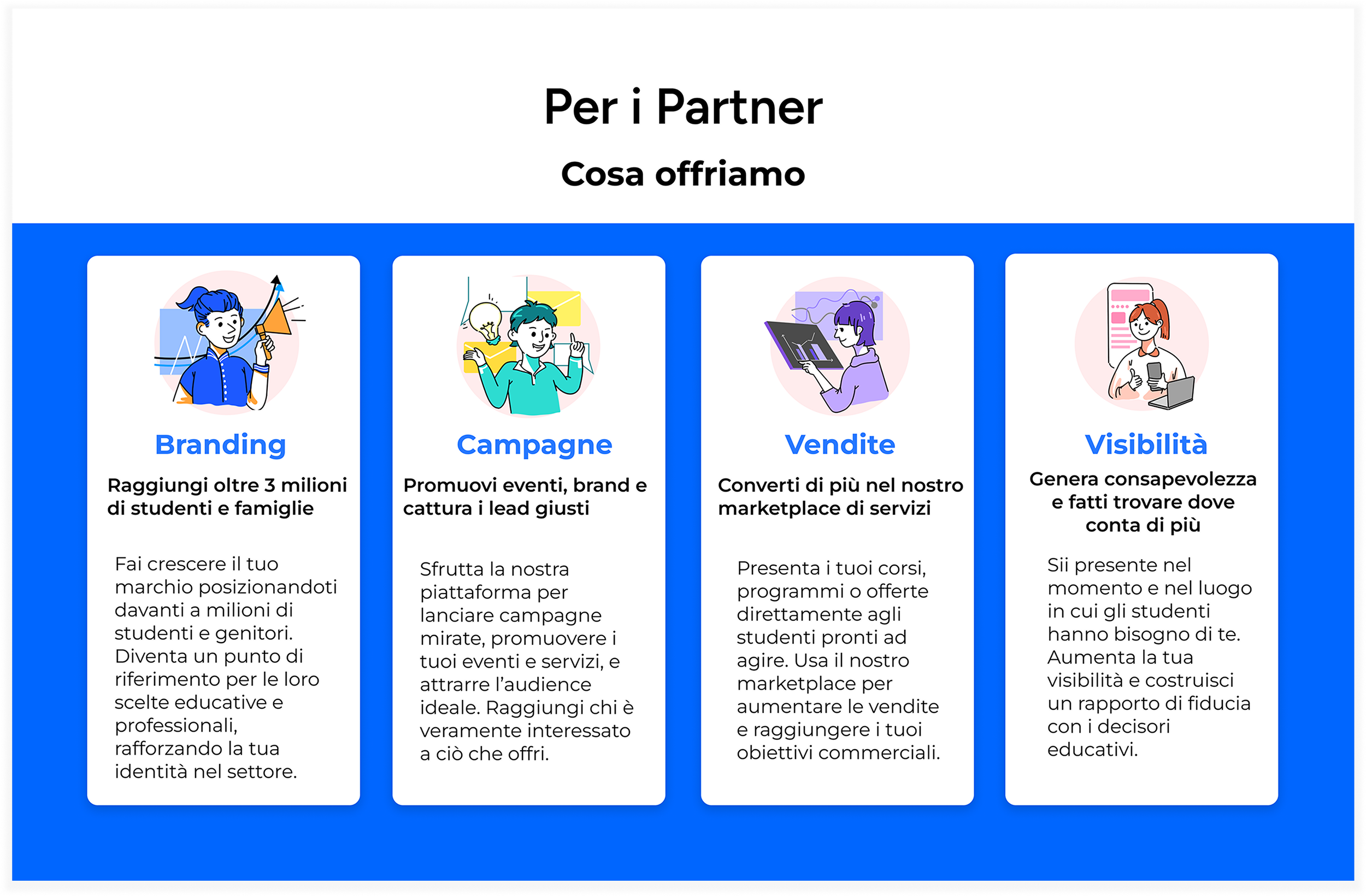
Part two : Illustration for the App & Web
illustrations & icons
